

 |
|
 |
 |
Original: watercolour, fabric, ballpoint pen on cardboard; British Columbia, 29 May 1964 |
 |
Original: pencil crayon; Ontario, 14 July 1964 The stars on the vertical red represent the ten Provinces. |
 |
Original: construction paper; British Columbia, 23 May 1964 The while leaf represents purity, innocence, peace and that Canada is a northern country. The blue field symbolizes vigilance, perseverance, justice, loyalty, and that Canada reaches from sea to sea. The colours of this flag are the same as those of the United Nations flag, and for Canada as a peace-loving country this is very appropriate. |
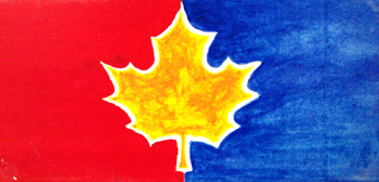 |
Original: watercolour; British Columbia, 18 May 1964 The red part of the field stands for courage and the blue for justice, also each could represent our founding heritages; the gold maple leaf stands for all Canadians together. If we must have a new flag I hope we will have one similar to this with authority inherent in it and not one that looks like a label off a bottle of Canadian beer. |
 |
Original: pencil crayon; enlargement; British Columbia, 22 May 1964 |